Hazel’s Trip to RISD Museum
As humans, it is impossible to experience art without accounting for the way it exists on its own, in relationship to other artworks, and in its surrounding environment. In other words, every piece of art in a museum setting must already be in context or given context so that the work can be fully seen and understood.
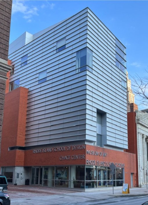
The RISD museum sits between North Main street and Benefit street in Providence, Rhode Island; two bustling streets that house various collegiate, institutional, and administrative buildings. The museum boasts a range of works but on this particular visit, I attended the exhibit, “Art and Design from 1900 to Now”, which is located in the Chace Gallery.
The Chace gallery is currently home to one of the modern and contemporary exhibits on display: the works here consist of paintings, photography, sculptures and textiles which were assembled with the help of staff, faculty, teachers, and students all part or familiar with the RISD community.
The layout and experience of this exhibit felt very intentional, specifically in relation to how people interacted with the works and moved around the space. A majority of the 2D pieces were mounted on walls and were experienced by moving either in a clockwise or counterclockwise direction around the room.
The 3D pieces were located mostly in the center of the room with a few that were located along the walls and displayed in a manner directed or approved by the artist.
All of the pieces were accompanied with labels briefly describing the artist, their work, and how the piece got to be displayed in the museum. These texts are so crucial in how the viewer sees and experiences the work because it clearly states how the work arrived and continues to be in dialogue with it’s now different surroundings in which it was originally made.
As I moved around the gallery, I kept moving in a counterclockwise direction away from the main entrance. This approach was mostly attributed to the fact that most of the works were located on the left side to provide a clear path for those exiting the space on the right. By doing this, I was able to keep my focus solely on the work that was in front of me and not behind me.
After making my way around the room, I turned my focus to the 3D works that were located in the center of the room. The works located in the center were physically larger and some called for their own standalone walls or platforms: by doing this, the curators allowed the 3D works to be viewed from multiple or all directions.
Compared to the 2D works, the 3D works on platforms or display cases encouraged viewers to lean in, inspect, and admire the work in a manner that was not permitted when looking at the 2D works.
The contrast in how 2D pieces were displayed created a visual and physical transition. For a visual transition, the end of the wall demonstrated the end of the 2D pieces while the platforms indicated a refocus to the most prominent 3D pieces in the gallery. The only major divide in how this exhibit was organized and experienced, was seen in the use of blue accent walls and platforms. The use of color is used to draw attention but in this particular exhibit, it divided the viewers attention. The blue accents were very hard to ignore and I noticed I felt pulled to look at the works that were on blue walls and platforms even when they were not in the direction in which I was moving through the space.
My time at Chase gallery revealed that when it comes to creating an amazing exhibit, artists, curators, and designers can and should provide a space that is in dialogue with the body of works being hosted. This can be achieved through transparency as to how the work was acquired, how the works are displayed in space, and how designers anticipate how humans interact with art in museums.


