Reflections on the Walker Art Center Minneapolis
A few months ago, I was in Minneapolis. One of the places I was very interested in visiting was the Walker Art Center. The Walker Art Center was originally designed by Edward Larrabee Barnes (1971), with an addition in 1985 by Herzog & de Meuron. Generally, the architecture community speaks favorably about the Walker, but my experience was very disappointing. As I walked around the complex I kept thinking, this is an example of how architect's fail us even in the midst of moments of beauty.
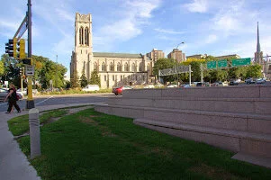
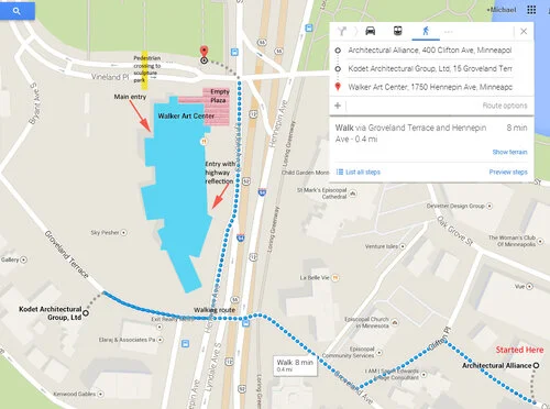
Possibly my reaction came because I walked to the Walker. I didn't rent a car and had an appointment earlier in the day about a half-mile from the museum. It was a pleasant sunny October day so I walked through a pretty residential area and across a major six lane road and arrived ... or had I? The Walker sits at the corner of an intersection with the sculpture park on one side and the museum itself on the other. Right at the corner is sort of an open plaza. I say "sort of" because there is nothing connected to the wide flat space. If you walk a couple hundred yards along the flat plinth, there is an entrance to the Herzog & de Meuron addition or you can go around the corner to the main entry off the original Barnes Building. However at the corner is just this empty space. Both the horizontal and vertical surfaces are glazed plum colored brinks, some wide low stairs that mediate the topography and ratty grass. The steps are buckling and seem to be in disrepair. The is no signage, nothing to mitigate the scale. No direction to either entry.
Empty plaza at the corner, no sign of an entry.
Walking route
Walking to the Herzog & de Meuron entry, I was struck by the reflection in the glass doors. It was a reflection of highway signs – the major road an entry ramp to the highway – so as I walked towards entry of the building it felt like I was entering the highway.


